lighter catalogue


More info
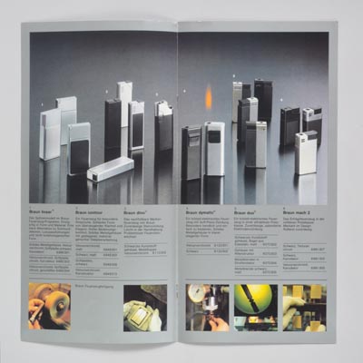
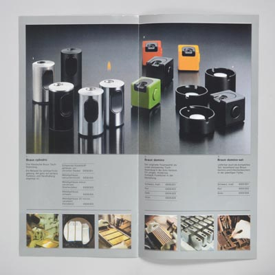
Lighter catalogue with heightened colours typical of mid-'70s Braun brochures. The tension between pop and functionalist aesthetics evident within the lighter range is repeated at the level of graphic standards in the contradiction between strictly ordered text blocks and the free arrangement of photographed objects, a contradiction that would not have been permitted 10 years previously.
see this 1990s example of a return to more disciplined standards
1/3


